You see them everywhere. Perhaps without even realising it.
Click here.
Fill out the field below.
Click Next to continue.
Loads of instructions telling us where to look on the screen so we can keep moving forward.
But what if you’re visually impaired? Or not confident with technology? Or you’re dyslexic? Or perhaps neurodivergent? Maybe you’re battling a migraine today, or have an acquired brain injury.
The truth is, most of us find it easier to navigate thoughtfully-designed and accessible content. It’s faster, easier and just a downright nicer experience.
But if your audience includes those with some form of disability, mental health challenges, speak English as their second language, or have a temporary impairment, then clear navigation isn’t just a nice-to-have.
It’s crucial.
Navigational no-nos
So the technical term for asking a user to look around a screen to find their next click is “referring to user interface (UI) elements”.
Which is a big mouthful meaning any time you’re asking a user to look below, above, next to, click Next, click Continue, click OK, you’re making it harder on your users, with and without impairments.
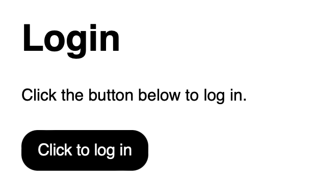
Figure 1. An example of inaccessible navigation
In Figure 1, the user is being asked to refer to the button below. The copy is also quite repetitive between the header, body copy and the button. “Log in” is used three times, and the spelling is inconsistent between a verb and noun. This could create a poor and confusing experience.
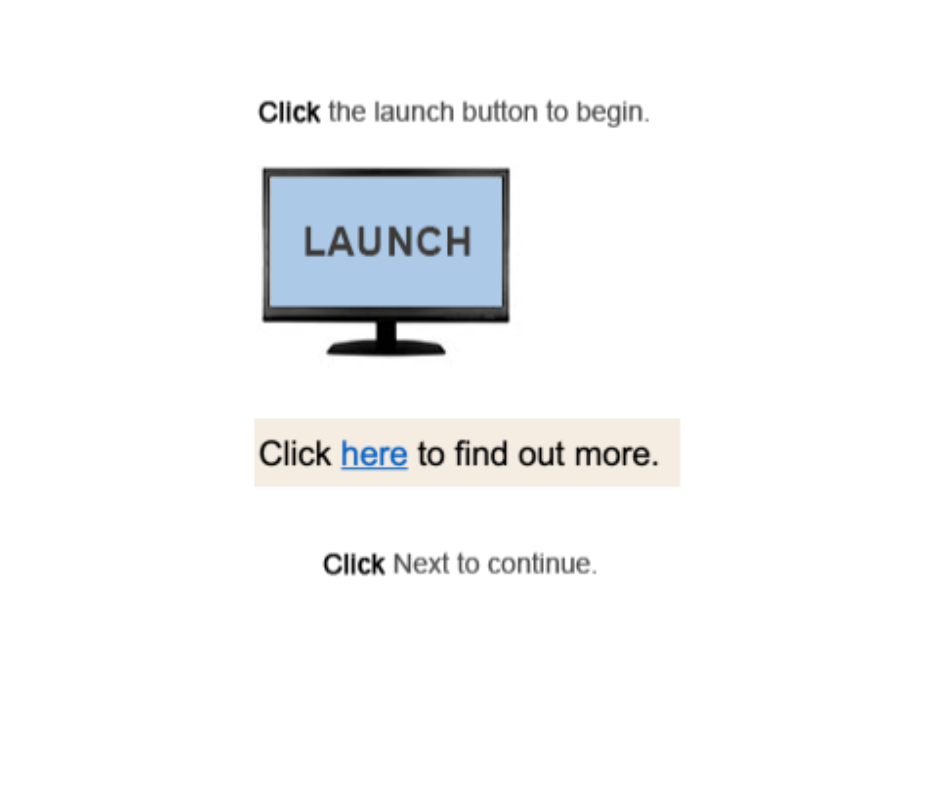
I’ve included some more examples of how inaccessible navigation might show up in the wild in Figure 2. Again, UI elements are being referred to, as well as the often-used “Click here” without any context as to where the user might be taken.
How to help everyone find what they need
Instead, Figure 3 shows a design simply instructing the user why they need to log in, what they’ll need and a clearly labelled button.
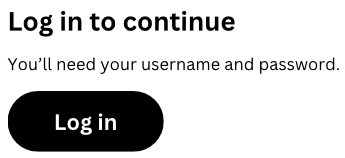
Figure 3. The same outcome as Figure 1 but with clearer navigation
It’s a small change on the surface, but if you smooth out a few of these moments within your user’s journey it truly helps them.
It doesn’t matter if the user journey is to complete a transaction, access information or make changes to something, this type of user-centric thinking is invaluable.
You'll help your organisation achieve its intended outcomes, while helping your user achieve their goals.
And what about "Click here"? How do I fix that?
Believe it or not, this is one of the easier challenges to overcome, by using contextual links.
Contextual links mean giving a link within the context of a complete sentence. Instead of "Click here" you might say:
- We'll manage your personal details in line with our privacy policy
or,
- Find out what you can and can't do on a day of Total Fire Ban
and then embed the links into the key part of your sentence. In these examples, I'd link "privacy policy" and "can and can't do".
Figure 4. The Country Fire Authority (CFA) has a nice example on their website
By replacing "Click here" with contextual links you're making your content easier to read, saving every user time by helping them understand where the link takes them, and helping those using screen readers.
As some visually-impaired users will navigate quickly through a web page by tabbing between headings and links, a contextual link helps them understand where they'll be navigating to if they select it.
Accessible design isn't always easy, but it's always worth the effort
I'm the first to admit that accessible design takes a shift in mindset and some creative thinking. It wasn't too long ago I was churning out inaccessible content and thinking about things only from my perspective, rather than that of my audience.
But as Maya Angelou once famously said "Do the best you can until you know better. Then, when you know better, do better".
If any content deserves to be accessible, and easily understood by its intended audience, it's your critical content.